Sunday, September 9, 2007

Concept in Form


My role on this amazing project was, in part, to select the colour palette which included the laminated glass. In this instance a second floor meeting room becomes a glowing glass beacon to the public lobby below. Wrapped in metal 'chopsticks' and projected into open air space the LED fixtures illuminate this glass form on a scale unmatched anywhere else in the project. This is the design introduction at Shaw Tower - the Lantern.

Saturday, August 25, 2007

Maybe it's the carpenter in me, but I love millwork!


Millwork can be such a diverse element in interior design. I love creating something so functional that can be so dramatically different looking to reflect its surroundings. The flavour of Shaw's breakout millwork came from a pallete of white laminate fronts, slim line stainless steel or white solid surface tops and coloured resin slider panel uppers. In special locations wood in big block form gave contrast to the cool white cabinets.

Detail Is A Verb


As the program and the concept took form a unique vernacular also began to take shape. We as designers were educating ourselves about the mix of materials we had on our pallete and challenging the trades with details and materials being used in new ways. The process was most gratifying and the result very rewarding. Shown is a row of edit booths veiled behind a cascade of glass, as we called it. The vocabulary of coloured glass and "chopstick" mullions repeats itself at other digital activity spaces.

Wednesday, August 22, 2007

Colour and Materials


A neutral backdrop throughout the eight floors of Shaw's space allowed colour to be precious. Coloured glazing, rich fabrics and custom wool carpets create a lushness.

Tuesday, August 21, 2007

Islands of Refuge


On call center floors at Shaw Tower staff breakout areas are energetic colour pops -- it's all about the Shaw culture. These little islands are fun indulgences of colour and materials. From accross a floor of work stations, staff are sure see the self-contained breakout/coffee/cubby areas. Each had a different colour scheme that correlated from floor to floor.

I heart RCP's


The ceilings on this project were sculptural planes that created flow and tension in an otherwise open plan. This dramatic sweeping curve not only defines the core of the Tower, it subtly reinforces Shaw's brand identity. Its epicenter is the center of the tower itself. The angular form plays off the rhythm a zig zag floor plan below.

Sunday, July 15, 2007

Creating a Design Vocabulary


The Shaw Tower design language evolved from a broad concept to a selection of forms, materials, colours, and details. Thanks to a brilliant couple of lead designers on this project the concept informing our direction was very strong from the begining yet each of us were able to explore new facets of that idea. When a certain design or detail resonated with the team it became part of the design language. It's what we in the industry call "process" and it's probably the most exciting part of design for me - translating a concept and a program into a 'design vocabulary'.
In this illustration a recurring element, the staff break-out area, had many interpretations before the final solution.

Design to Reality


As part of the greater design, these elevator lobbies were treated as colour-saturated expressions of the concept. Each floor had a different colour story and its own variation on the carpet design serving also as way-finding. The custom wool carpets were close to my heart. I actually specified the colour design for each 2" x 2" square.

Thursday, July 12, 2007

Concept Sections Through Shaw Tower


The base building design of Shaw Tower is an expression of natural, regional materials. Shaw's presence on the main floor is prominent and had to complement its surroundings. We combined warped and organic forms with coloured light and translucency as a soft foil to the architect's wood and stone. LED lights glow and shift from the glass "lantern" meeting room over-looking the main entry way. An organic light form unfurls through the elevator lobby. The affect is an allusion to what awaits you around the corner.

Totally oscillating


As my father's daughter I just had to get into power tools. One of my projects was this oscillating shelf unit that is fit together with interlocking finger joints. I don't know what was harder - wrapping my head around joinery pattern or painting it once it was finished! In the end it became the proud show place for my collection of snowglobes from around the world.

Tuesday, July 10, 2007

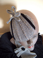
Fancy Hats


Once in a while I get in the mood to sew little sculptures and call them hats. These are just a few. Each one has seen the light of day if only once and then I'm on to the next project.

Sunday, July 8, 2007

Helmet Hoods


There's a crazy influx of two-wheeled things in this city and I mean that in the best way. There are more bicycles, scooters, mopeds, motorcycles and segways than there are children (though not as many as there are little dogs). I ride a scooter and therefore wear a helmet and through that invented Helmet Hoods (TM). They're totally cute and completely useful for helmet-head avoidance. This too has its own website!
www.helmethoods.net

the Paper Dolls


I've been exercising my graphic muscles on all my band's visual stuff. We are an all-girl, all-ukulele, three-part vocal harmony trio called the Paper Dolls. I love us and we have fans from 2 to 92, Fresno to who knows where. See our website at
www.thepaperdollsband.com
Website credits:
Graphics by myself (collages by the Paper Dolls)
Webmastery by Johanna Schwartz

Stationary in the city


These little guys were an off-shoot of my love for drawing. Each is a scene of a less than remarkable vignette in the city, but a very real little portrait of my daily surroundings. There's a view from Maxfield's on Dolores at 17th, on the right is a street on Potrero Hill with a soccer ball rolling past at 20mph. Also in the collection are scenes from the Duboce over pass under construction and rooftops and power lines as veiwed from my back stairs. One of the best things about being a designer, I always thought, was that I got paid to draw and colour, but now it's really rare to actually put pen to paper. Pity, isn't it?